Contract tokens
94
One source of truth: theme.json.
Case study · Community Food Co-op · Jun–Aug 2026
The co-op’s website runs on a WordPress theme I designed. In summer 2026 I replaced its drifted CSS with one token contract: written once in theme.json, emitted as CSS variables, mirrored as Figma variables, and checked for drift in both directions before any design work starts.
Contract tokens
94
One source of truth: theme.json.
Figma variables
60
The other 34 are documented as deliberately not mirrored.
Unexplained deltas
0
Both directions. All four recorded parity runs ended in PASS.
Raw font sizes left
3
In the front-end CSS, down from 66 before the cleanup.
The theme carried what its own audit called “a decade of drifted, hardcoded, duplicated CSS”. The front end had 66 raw font-size declarations, z-index values as high as 9999999, and nine competing page widths with no shared token.
One bug sat underneath it all. WordPress core silently overrides four font-size slugs unless a theme opts out, so body text had been rendering at 20 px instead of 16–17, and a retune did nothing for four of the six sizes.
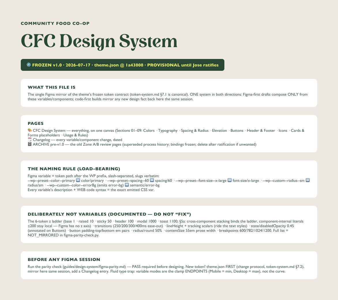
I decided against the usual second vocabulary, a --brand-green layer on top of WordPress. WordPress already turns theme.json into variables like --wp--preset--color--primary, so those emitted names are the contract, with “no parallel --cfc-* layer”.
The editor’s colour picker, the front-end CSS, the Figma file and the bakery plugin now speak the same strings. The cost is written down too: camelCase keys come out kebab-case, and one slug keeps its capital letter because renaming it would mean migrating saved content.
Every variable’s description + WEB code syntax carries the exact emitted var — Figma→CSS resolves with zero lookup tables.
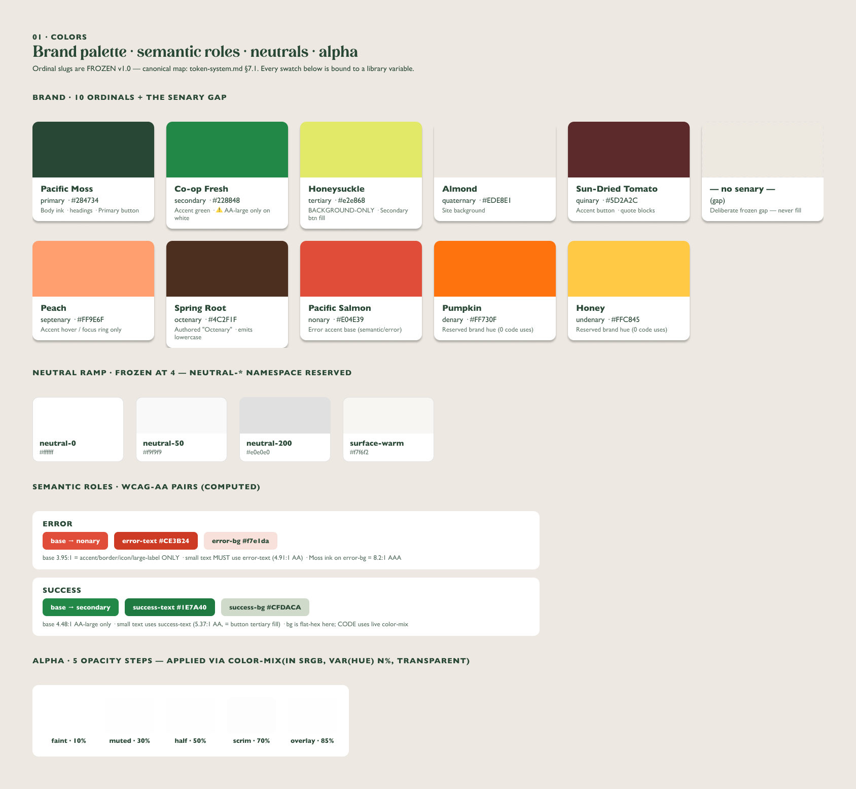
The contract holds 94 tokens: 10 brand colours, 6 spacing steps, 6 font sizes, 2 families and 70 custom keys. Spacing is a fixed 8 px ladder with a deliberate gap at 12. The palette skips its sixth ordinal on purpose, because filling it would shift the mapping.
Figure 1 · Contract tokens by family
The 94 tokens in theme.json v1.1, by family. Colour is drawn as two rows: brand, and semantic + neutral.
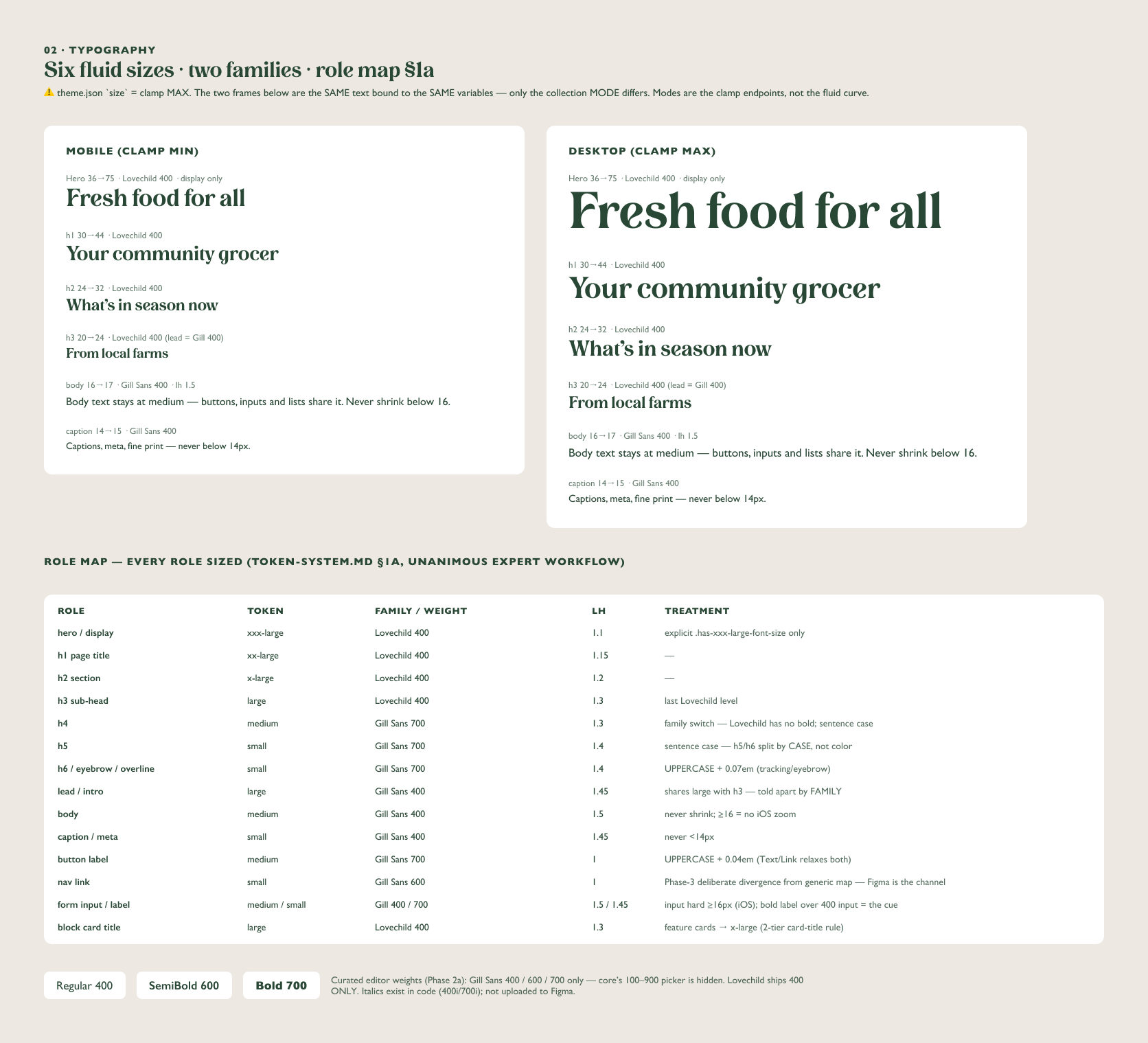
Fluid type has no Figma equivalent, so the system mirrors “the endpoints, not the curve”. The Type collection has two modes: Mobile is each clamp() minimum and Desktop its maximum, so body text reads 16 px in one and 17 in the other, and the largest size 36 and 75.
| Type variable | Mobile | Desktop |
|---|---|---|
font-size/small | 14 | 15 |
font-size/medium | 16 | 17 |
font-size/large | 20 | 24 |
font-size/x-large | 24 | 32 |
font-size/xx-large | 30 | 44 |
font-size/xxx-large | 36 | 75 |
clamp(); the dashed line between them is the part Figma doesn’t draw.Before any design session, a 221-line Python script compares a dump of the Figma variables with theme.json. Every token must exist in Figma or be listed as not mirrored, with a reason. Every Figma variable must map back to a real token, values and alias targets must match, and the five shadow styles must exist.
Any other result prints the delta and exits 1. The only passing line is this one:
PARITY PASS — zero unexplained deltas (both directions).The allowlist doubles as documentation: 34 tokens are deliberately not variables, such as the z-index ladder (“Figma has no z axis”) and transitions (“no time axis”). All four recorded runs ended in PASS; the last, on 21 August, first caught radius/pill drifting from 999 to 99.
A project skill tells every Claude session to name each token by slug before writing CSS, and to end with a proof table for every raw value in its diff. A lint script with six rule families runs as a PostToolUse hook after each CSS edit, and exits 2 to put the violation, with file and line, back in the conversation.
I tested it cold on four models, with bare asks like “try a new orange, something vivid like a tangerine” and “hardcode 13px”. The skill triggered unprompted, contrast math ruled out white on orange, and a planted #ff6600 made the hook fire.
The hook is the backstop, not the process.
Nobody hardcodes “for now”; the session proposes a name, a value and a reason.
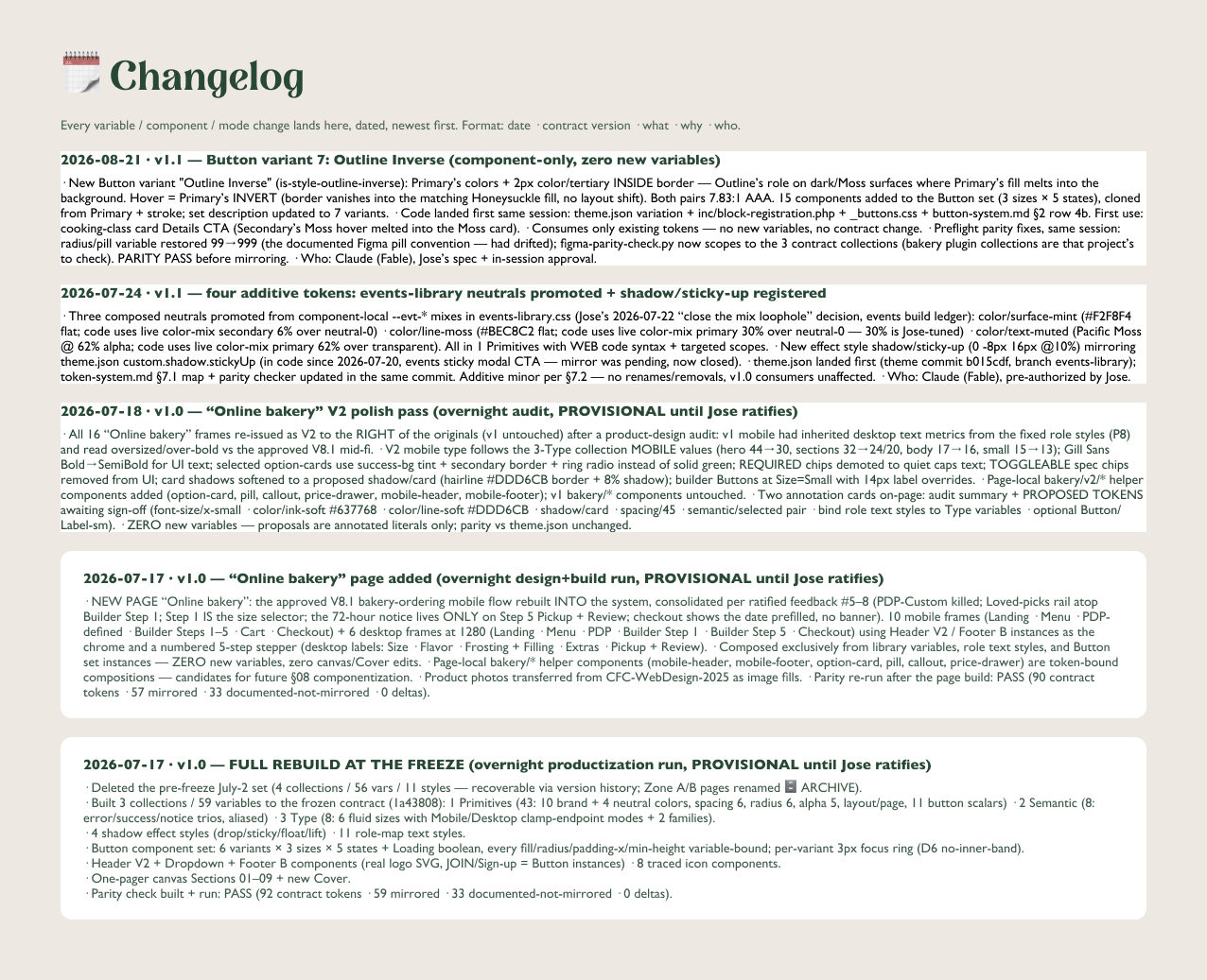
Then the token is mirrored to Figma in the same session and gets a dated changelog entry.
A rename also needs a migration note, and the bakery plugin’s copy of the contract updated in the same change.
A mix hidden inside one component is a consistency leak.
Grow the system through the front door, never silently.
The cleanup ran from 25 June to 21 August; 359 commits landed in that window. On 17 July an overnight run froze v1.0 at commit 1a43808, rebuilt the Figma library to match, and shipped the checker, the skill and the hook. The next morning I ratified 13 of its 14 provisional calls and reversed one.
Figure 2 · Theme commits per day
Commits per day on the theme repo, March to September 2026. The design-system window, 25 June to 21 August, is shaded; v1.0 is marked on 17 July.
| Front-end CSS | 24 June | 10 September |
|---|---|---|
var(--wp--preset--…) references | 446 | 1,270 |
var(--wp--custom--…) references | 0 | 518 |
| Raw font-size declarations | 66 | 3 |
| Raw hex lines | 26 | 14plus 25 tagged exceptions |
| Raw z-index of 100 or more | 12 | 6all in documented contexts |
Changes were verified by diff, not by eye: 59 font-size repoints with 0 regressions, and a 64-agent visual diff of 32 surfaces at two widths that also found 0.
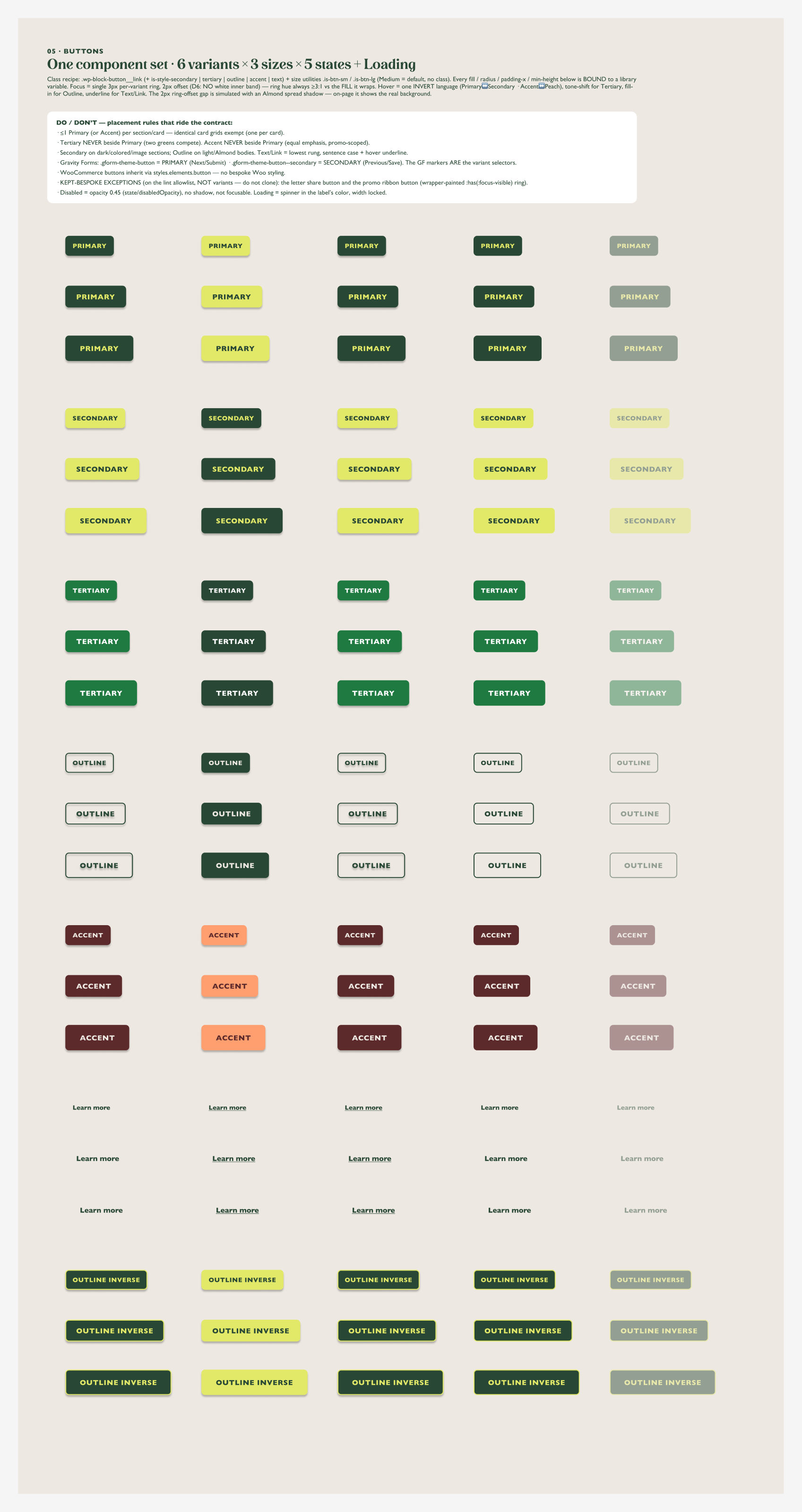
The library has three collections and 60 variables, each with its code syntax set to the exact CSS variable. The Button is one component set of 7 variants, 3 sizes and 5 states, 105 in all plus a Loading switch, with its placement rules written on the canvas.
Contrast is computed, not eyeballed. White on the brand green measured 4.48:1, which “fails AA by 0.02”, so the Tertiary fill was darkened from #228848 to #1E7A40.
 Full set
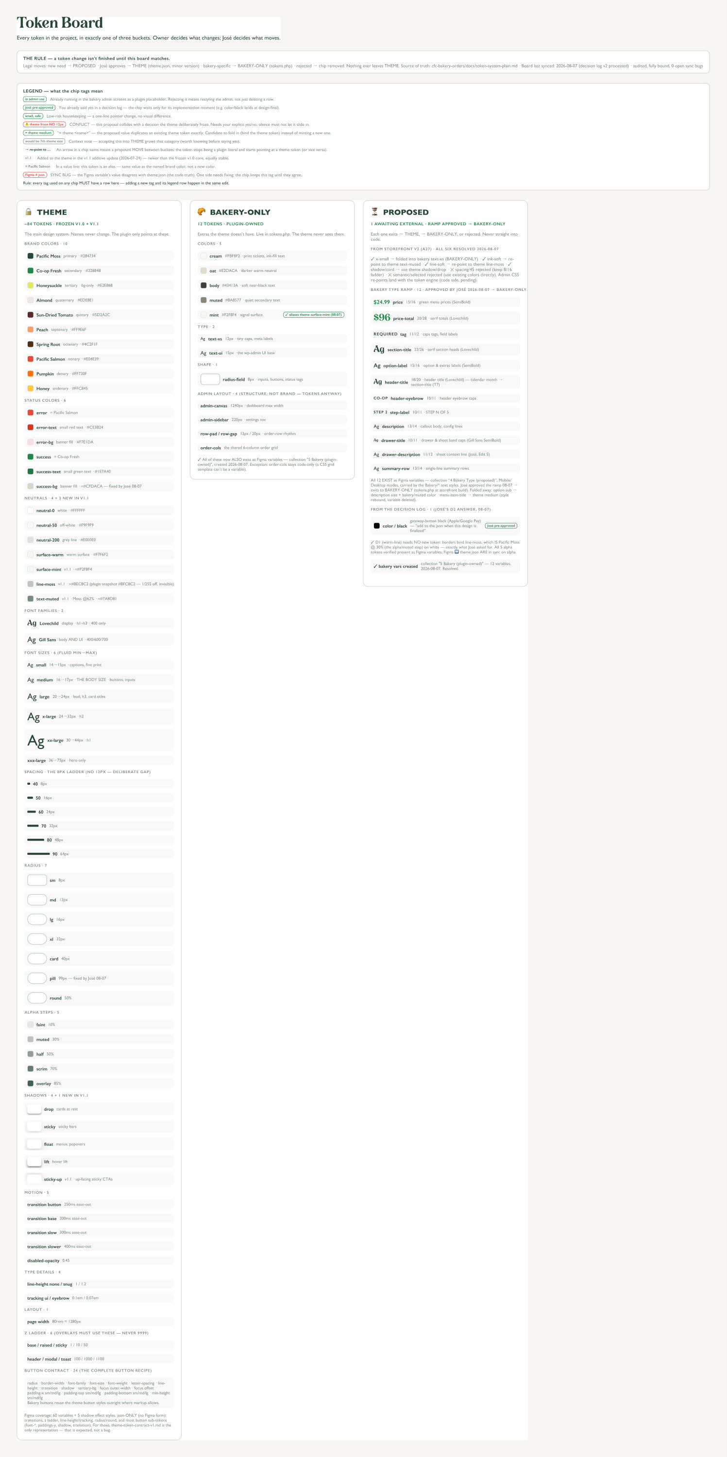 Full board
On 7 November the production site’s markup carried the theme, the Header V2 design, the button variants and 68 custom properties from the contract.
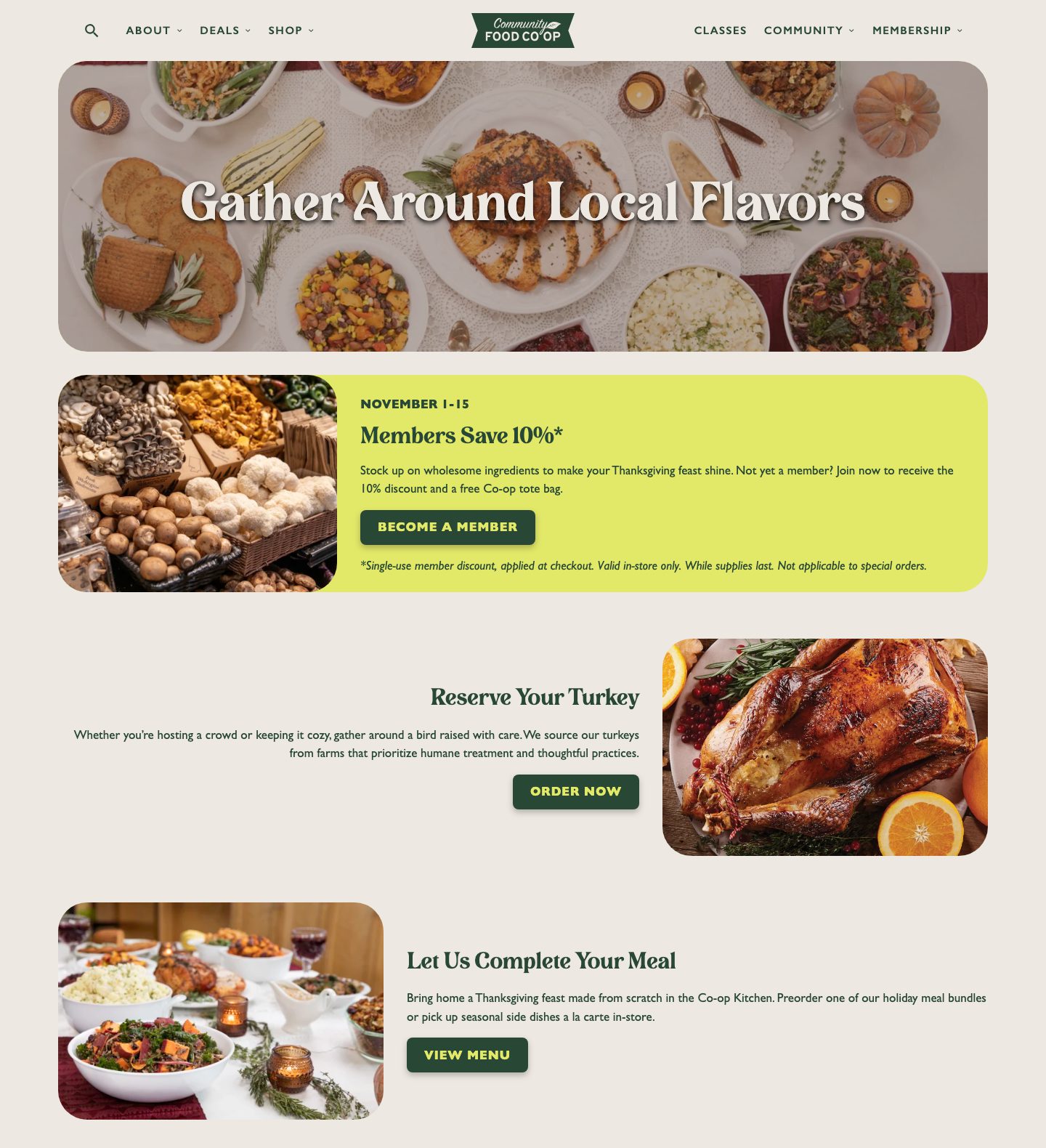 Full capture
